
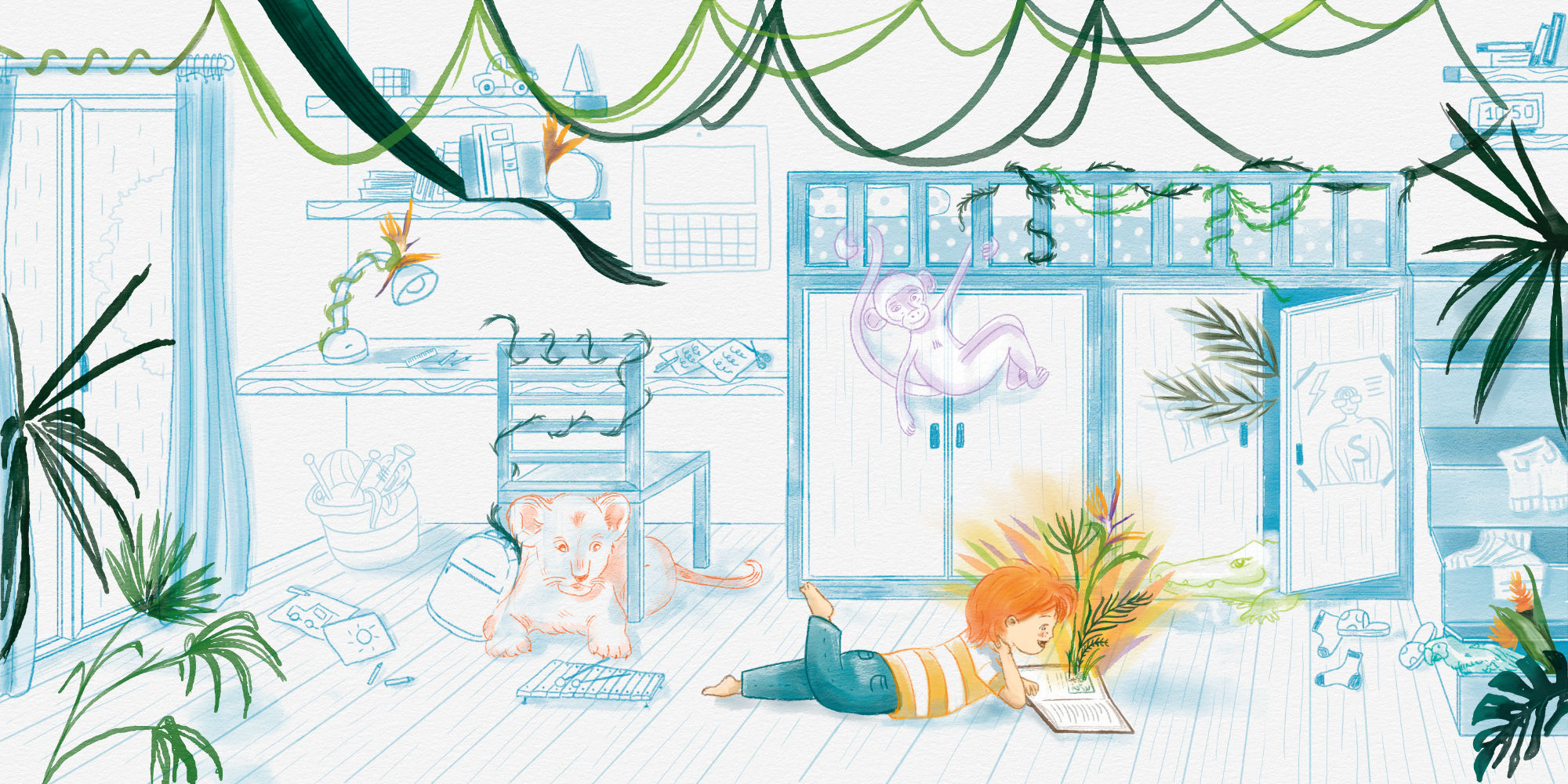
How much work goes into creating a picture book or a children’s book?
What are the different stages of the process?
Let’s explore it together in this article 😊
If you prefer listening instead of reading, here’s the related video on YouTube:
Where does the idea come from?
Let’s start with how the idea for a picture book can be born. Of course, this is very subjective, so I’ll share my own way of working, which might also inspire you.
I make extensive use of a sketchbook: I draw and paint in it often, even without a specific commission or request from a client. I do it frequently—though not every day as I would like 😊—and I’ve realized that having this archive of sketches often gives me a starting point for future projects.
From time to time, I go back through my sketchbooks and find an illustration that stands out to me in that particular moment—one that “speaks” to me more than the others and sparks a narrative.
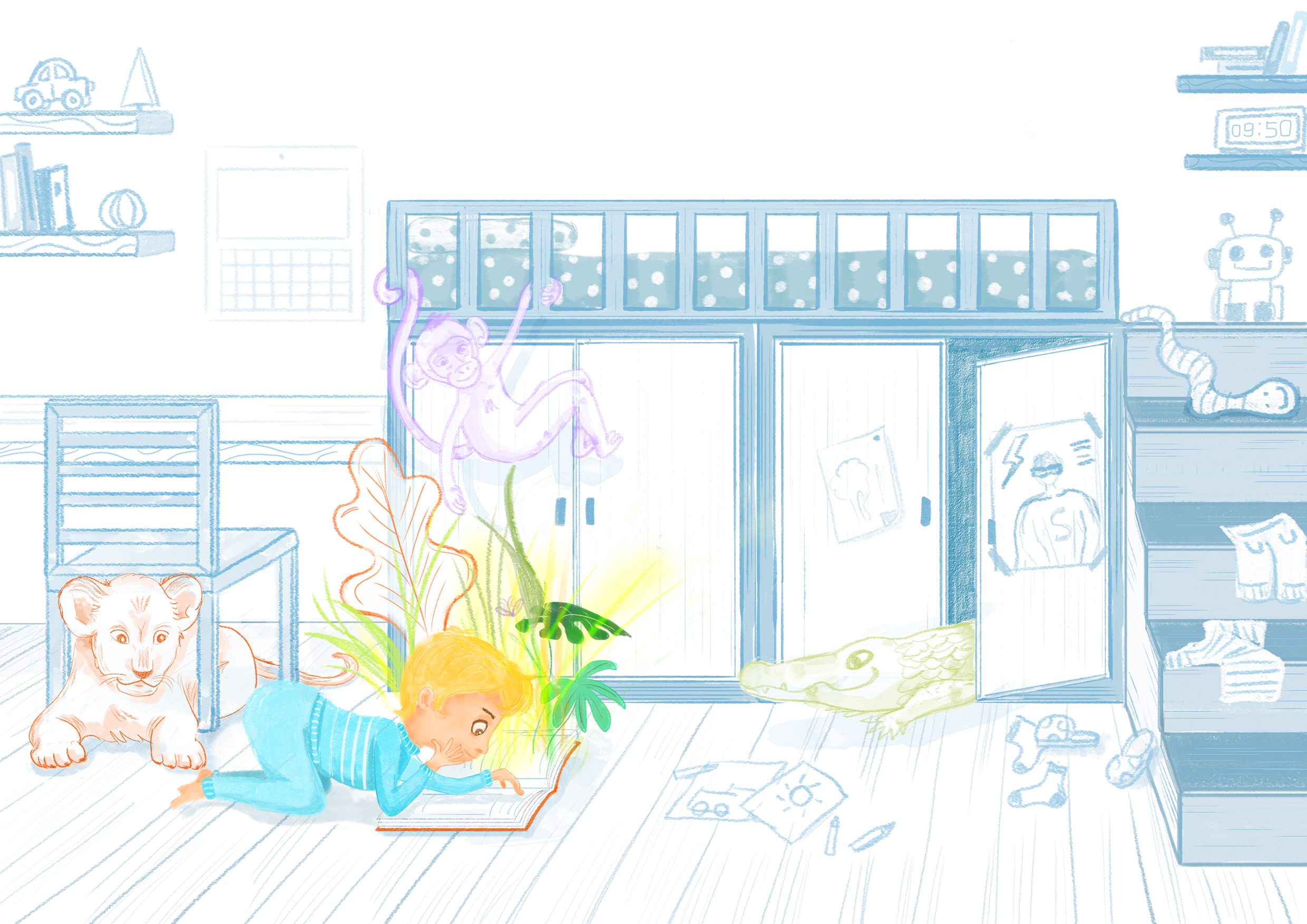
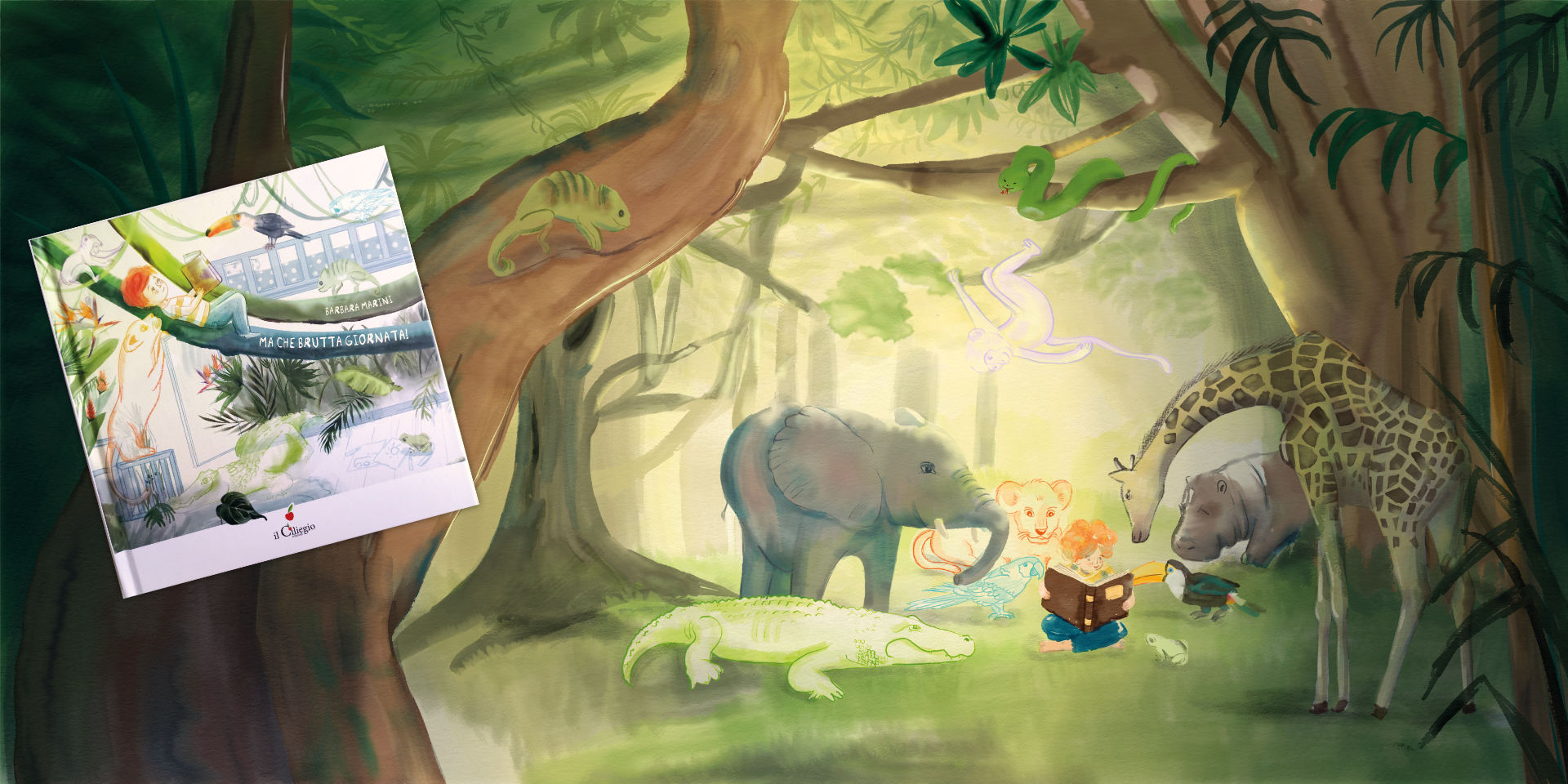
From that first sketch, other illustrations are developed, eventually forming the sequence of the book. This is exactly what happened with my latest picture book “Ma che brutta giornata!”, published by Edizioni Il Ciliegio (here you can find the link where I present it and here a video on my YouTube channel).
(Update February 2026: the cover illustration was selected for Annual 26, the prestigious publication celebrating contemporary Italian illustration 🤩).
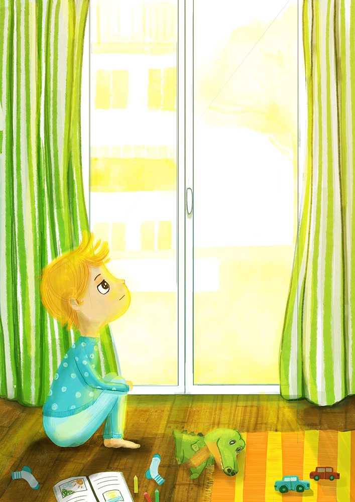
The “key illustration,” the very first image created, was born during the Covid period. We were all confined at home, and thinking about children stuck within four walls (including my own kids), I felt the need to put those emotions onto paper. That’s how the very first illustration came to life: a sad child looking out of the bedroom window, which you can also find in my portfolio.
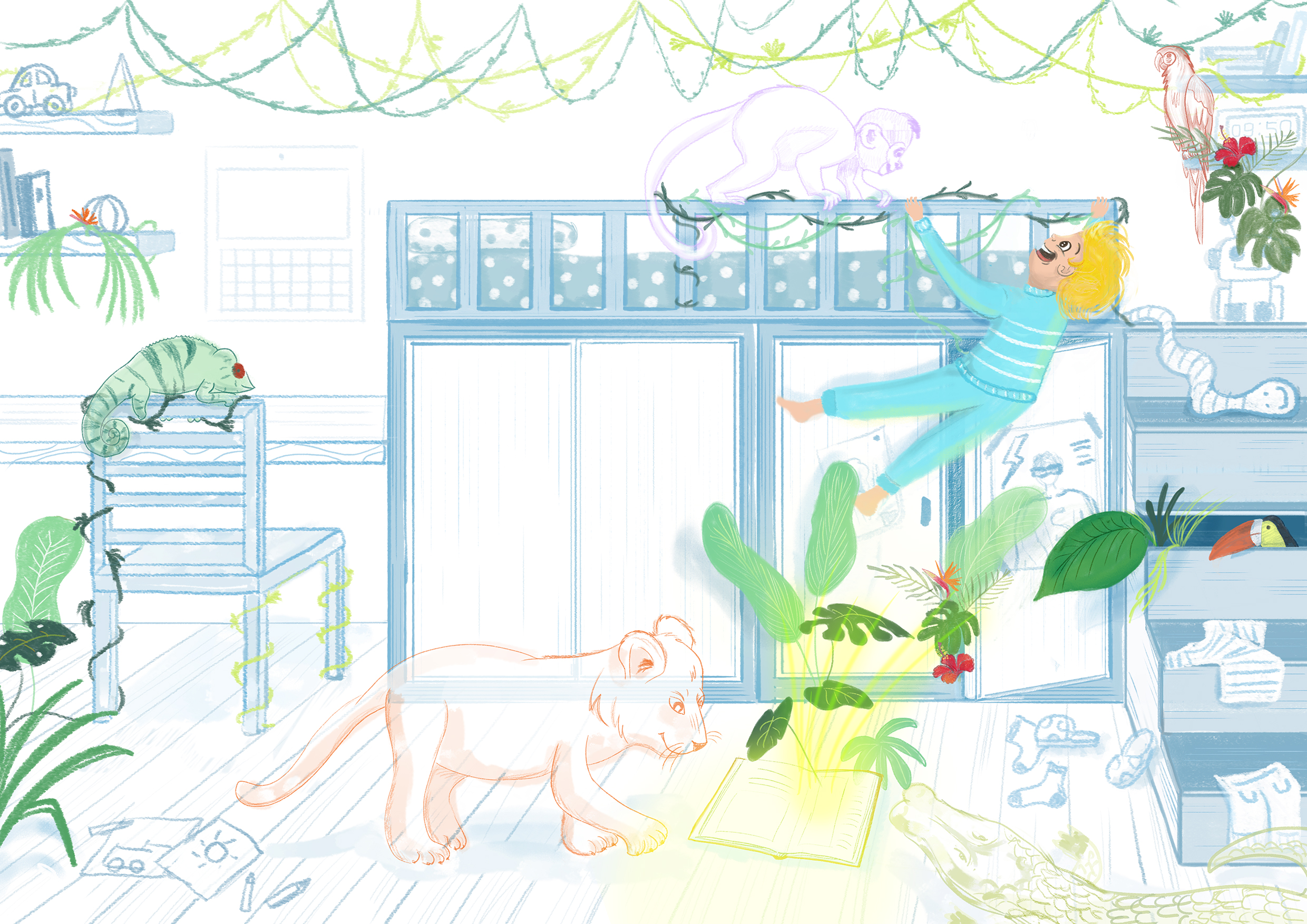
Other times, the idea comes from watching a film, visiting an exhibition, looking at a particular holiday photo, or even just listening to a song.
As several illustration teachers have told me over the years during the courses I attended to specialize in children’s illustration, an illustrator is a multidisciplinary figure: they must tell a story with their own voice, not just draw. That’s why curiosity toward other artistic disciplines is essential. In many ways, illustration has more in common with cinema than with painting, because it involves telling not just a single scene, but a scene within a sequence.
For example, the next picture book I’m currently working on (spoiler 😊) was inspired by a film, where a specific setting and certain characters sparked the initial idea for the story.
This is what happens not only when I’m the author of the books I design, but also when I illustrate texts written by other authors. The inspiration for settings, characters, and atmosphere develops in the same way.
Characters – Character Design
Whether I’m working on my own story or illustrating someone else’s text, I always start by defining the characters, which I believe are essential in establishing the overall atmosphere of the book.
Do I choose to use anthropomorphic animals?
Or is the character a child, a teenager, an adult? Even age helps define the mood of the story.
Then there’s clothing: vintage or modern? And what about colors? All of these elements are already conveyed through the character design.
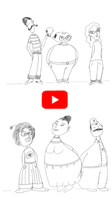
Here are a few examples of a character I’m currently developing for my next picture book, based on a text by another author.
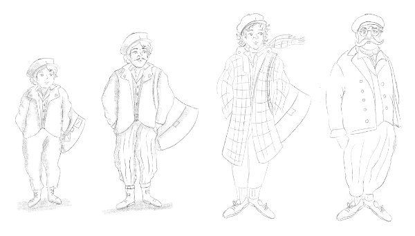
For this reason, after carefully reading the text, I try to give my own interpretation starting հենց from the main characters.
Remember: an illustrator is not just someone who draws, but an author—a co-author—because their illustrations bring a personal interpretation to the text.
That’s why, when I work on texts written by others, I immediately discuss the characters with the author or publisher, so we can start off on the right foot. And when the author tells you it’s beautiful and exactly what they had in mind… it makes you incredibly happy! 😍
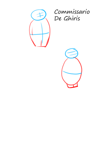
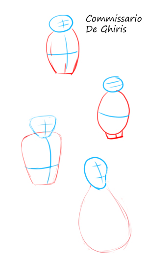
For character design, I rely heavily on my sketchbook and on the use of simple shapes: triangles (for more “villain-like” characters), circles (for softer, kinder ones), and so on.
This is a phase I really enjoy: short, big, tiny, slim, tall… it’s extremely creative!
You can see an example of the sketches I made to design Commissioner De Ghiris, the main character of another picture book I illustrated, published by Errekappa Edizioni.
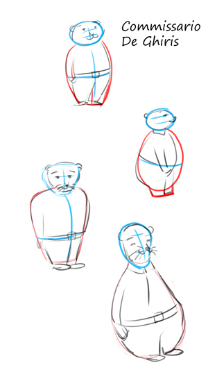
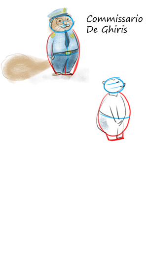
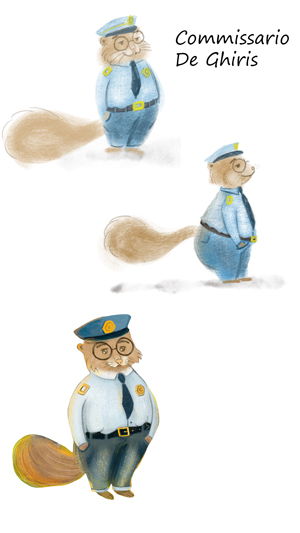
For poses and expressions, I often use reference photos of family members, asking them to pose like actors 😊
In my opinion, the character plays a key role in defining the mood we want to convey in the book.
If you’d like to see how I create the very first character sketches using basic shapes, you can watch these short videos on my YouTube channel.
Storyboard
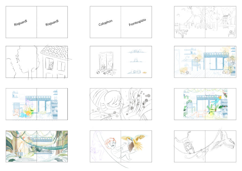
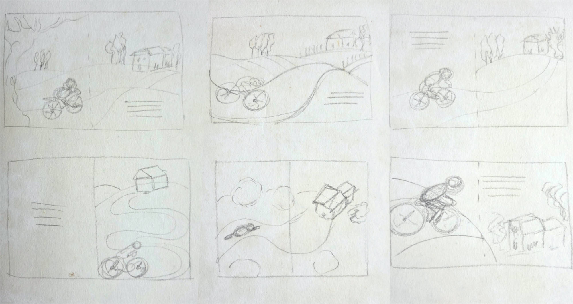
At this point, I move on to creating the storyboard. The storyboard is made up of many small, quick sketches that represent the double-page spreads (openings) which will accompany the text.
In the initial phase, I use very tiny sketches because I only need them to get an overall view of the book’s layout. In the image you see below, the full format is an A3 sheet with the first sketches for “Ma che brutta giornata!”. Some of the illustrations you see here didn’t even make it into the final book.
Storyboard
For me, the storyboard phase is the most creative: one single text, but endless ways to tell it!
At this stage, I decide how to divide the text into scenes, which moments to emphasize, the rhythm of the book, whether to use spot illustrations, single pages, or double-page spreads, and which emotions I want to highlight.
This is also the moment for cutting, removing pages, rearranging the sequence, and—very importantly—counting pages to make sure everything fits standard picture book formats: 24, 32, 40 pages, etc.
Then I move to a larger scale, creating a more refined storyboard with bigger sketches—for example, two spreads (two double pages) on an A4 sheet.
I begin to better define the drawings and think more carefully about pacing and framing.
For many illustrations, I experiment with different compositions and viewpoints: cropped, rotated, front view, bird’s-eye view, zoomed in, and so on.
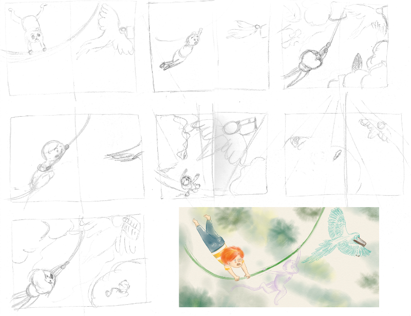
It’s very useful to study composition by simplifying sketches into large black and white areas. This stripped-down approach, without details, helps evaluate the effectiveness of the composition. I also take inspiration from photography (I love the work of Fontana and Robert Doisneau) as well as films and TV series—directors and photographers have already carefully studied their framing choices, which can be a great learning resource.
Refining Pencil Sketches
Once the initial sketches are defined, I move on to the final pencil drawings (“clean sketches”), still in black and white but with more detail, clean lines, and shading.
I scan my hand-drawn sketches and refine them digitally. For this phase, I use Clip Studio Paint, which has a very realistic pencil tool and allows for faster adjustments.
These refined sketches are what I send to publishers for project evaluation.
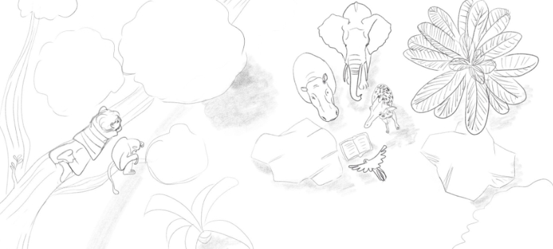
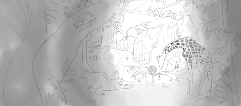
They are essential to get approval from the author or publisher before moving on to color, since making changes after coloring—especially with traditional techniques, but also digitally—can be much more complex.
That’s why, when presenting a project, I usually create only 2–3 fully colored illustrations. This way, if the project is accepted, there is still room to adjust, rearrange, or edit the sketches before finalizing everything.
Coloring the Final Illustrations
Once the sketches are approved, I move on to coloring 2–3 final illustrations.
I start by defining the color palette, which I consider fundamental for expressing the atmosphere and emotions of the book.
In “What a Terrible Day!”, I intentionally used a monochromatic blue palette for the first pages to convey sadness, loneliness, and boredom. Then, gradually, I introduced more colors, following the emotional rhythm of the story.
In this case, color choices were central to the entire concept, but in general, selecting the right palette is always crucial for communication. When working with an author or publisher, this choice is shared early on—especially when I use traditional techniques like watercolor and gouache.
I’ve also created several videos on my YouTube channel where I explain how I build my color palettes.
How to Submit a Book Project to Publishers
So, what do you actually send to a publisher?
I usually prepare an email including:
-
A project presentation (target audience, age range, strengths)
-
A synopsis
-
A short biography of the author and illustrator
-
The illustrator’s portfolio
Along with a PDF layout (created with InDesign or Affinity Publisher) that includes:
-
All the page-by-page sketches with the text
-
2–3 fully colored illustrations to show the final style
And then… I keep my fingers crossed! 😊
Patience is essential, as response times in publishing can often be quite long 😅
If you have any questions or doubts, feel free to write in the comments and follow me on YouTube and Instagram to stay updated on new videos and articles.
See you soon!
📖 READING PREVIEW
If you’d like to listen to the first pages of the picture book, check out the video on my YouTube channel.

If you have any questions, write in the comments—I’ll be happy to reply!
See you soon!
And if you have a beautiful story you’d like me to illustrate, I’d be very happy to talk about it together! 😊
If you’d like to see more children’s books I’ve worked on: CHILDREN’S BOOKS – PORTFOLIO


Want to stay updated on upcoming articles? Follow me on social media